




Introduction
Design principles form the backbone of effective multimedia artistry.
They guide artists in creating visually compelling work.
These principles enhance the communication of ideas and emotions.
Applying strong design principles significantly elevates multimedia art.
Artists can create more engaging experiences for viewers.
As a result, viewers can better understand and enjoy the artwork.
This post explores several essential design principles.
It focuses on balance, contrast, hierarchy, alignment, and repetition.
Each principle plays a crucial role in successful multimedia design.
Balance
Balance involves distributing visual weight evenly throughout a design.
Artists can achieve balance through symmetrical or asymmetrical arrangements.
A well-balanced composition maintains viewer interest and prevents chaos.
Contrast
Contrast creates visual interest and guides the viewer’s focus.
It involves using differences in color, size, and shape.
Therefore, artists can emphasize key elements through effective contrast.
Hierarchy
Hierarchy organizes elements according to their importance.
It helps viewers navigate the artwork more easily.
Artists use size, color, and placement to establish visual hierarchy.
Alignment
Alignment ensures that design elements relate to one another visually.
This principle creates a coherent composition and enhances professionalism.
Furthermore, proper alignment improves readability in text-heavy multimedia projects.
Repetition
Repetition strengthens a design by unifying separate elements.
It creates cohesion and consistency throughout a piece.
Artists can repeat colors, shapes, or patterns to reinforce themes.
By mastering these design principles, multimedia artists can refine their craft.
Strong design choices lead to more impactful art.
Ultimately, understanding these concepts elevates the viewer’s experience.
Balance in Multimedia Design
Balance distributes visual weight throughout a design.
It prevents one element from overpowering another.
As a result, balanced artwork creates harmony and stability.
Multimedia artists use balance to create engaging visual experiences.
Evenly distributed elements can create a more pleasant aesthetic.
However, an unbalanced design can distract viewers from the intended message.
Therefore, artists must understand balance when developing effective multimedia art.
Types of Balance in Visual Composition
Artists can achieve balance through several visual methods.
Symmetrical and asymmetrical balance offer two primary approaches.
Each approach can communicate a distinct mood or message.
- Symmetrical Balance: This approach mirrors elements across a central axis.
- It creates a formal and stable visual impression.
- Asymmetrical Balance: This approach combines varied elements that complement one another.
- It creates movement and interest without using mirrored forms.
Artists should select an approach that supports their project’s goals.
They should also consider how the intended audience may respond.
Methods for Achieving Visual Balance
Multimedia artists can evaluate several factors when balancing a composition.
Transform Your Career Today
Unlock a personalized career strategy that drives real results. Get tailored advice and a roadmap designed just for you.
Start NowThoughtful placement influences how viewers perceive visual weight.
Color, texture, scale, and space also shape the composition.
- Element Placement: Place heavier elements nearer the center to create stability.
- Color Usage: Dark or saturated colors usually carry greater visual weight.
- Lighter colors generally appear less visually heavy.
- Texture Variation: Textured elements can add weight and increase depth.
- Balanced textures help maintain visual interest.
- Size and Scale: Large elements can dominate a composition.
- Artists should control scale to preserve harmony.
- Positive and Negative Space: Filled areas and empty spaces can work together.
- This contrast can create tension, focus, and stronger visual impact.
By combining these factors, artists can guide the viewer’s eye.
They can also use balance to support emotional responses.
Examples of Balance in Multimedia Art
Successful multimedia art pieces can reveal how balance operates.
Studying these examples helps artists recognize effective compositional choices.
Different formats can apply balance in distinct but useful ways.
- “The Persistence of Memory” by Salvador Dali: Melting clocks create asymmetrical balance within a dreamlike landscape.
- The arrangement attracts attention while maintaining an engaging composition.
- “Nighthawks” by Edward Hopper: The bar scene demonstrates a strong sense of symmetry.
- Figures and architectural elements create an intimate, balanced setting.
- Online Interactive Exhibits: Digital exhibits often use balance within user experience design.
- Guided navigation can distribute visual weight across different screens.
- Animated Short Films: Balanced movement can strengthen audience engagement.
- Characters and backgrounds must harmonize within a cohesive narrative experience.
These examples show how balance influences perception and emotional response.
Artists can analyze successful pieces to strengthen their compositional understanding.
The Role of Balance in Multimedia Art
Recognizing balance can elevate an artist’s work.
Balanced designs can improve viewer satisfaction and understanding.
Moreover, skilled balance can support a consistent brand identity.
Visually appealing artwork can capture attention in an information-rich environment.
Multimedia art includes formats such as video, animation, and graphics.
Each format benefits from careful attention to visual balance.
Consequently, artists should refine their skills through practice and observation.
Developing Balance as a Creative Skill
Balance remains a critical design principle for multimedia artists.
It enhances aesthetic appeal and encourages audience engagement.
Artists can create compelling work by combining different balancing techniques.
As creative practices evolve, artists should continue adapting their approach.
This ongoing effort can enrich their artwork and visual storytelling skills.
Ultimately, balance provides a foundation for creative expression in multimedia art.
Understanding Contrast in Design
Contrast forms a fundamental principle in design.
It enriches visual interest and strengthens communication.
By juxtaposing different elements, artists create striking visuals.
This principle engages viewers and directs their attention.
Effective contrast simplifies complex ideas and emphasizes important components.
Without contrast, designs may appear flat or unengaging.
Artists create contrast through several visual elements.
- Color: Light colors against dark colors create strong contrast.
- Size: Large elements against smaller ones strengthen visual focus.
- Texture: Smooth and rough textures add depth.
- Shape: Geometric and organic shapes create visual tension.
- Space: Negative space allows important elements to stand out.
Therefore, multimedia artists must understand how to use these elements effectively.
Using Contrast Effectively
Multimedia artists can apply several practical strategies to use contrast effectively.
These strategies create hierarchy, guide attention, and strengthen visual communication.
Artists can also adjust each technique to suit their composition.
- Establish a Color Palette: Choose opposing colors on the color wheel to spark visual interest.
- Use Blue and Orange: Pairing blue with orange generates dynamic visual energy.
- Vary Element Sizes: Use different sizes to create hierarchy and direct attention toward focal points.
- Emphasize Typography: Large typography can highlight important messages.
- Mix Textures: Combine smooth digital illustrations with rough organic textures to add depth.
- Explore Shape Variations: Pair sharp angles with soft curves to create visual tension.
- Utilize Negative Space: Leave open areas so important elements remain clear and prominent.
- Experiment with Typography: Combine varied fonts to create contrast and improve readability.
- Highlight Key Elements: Use contrast to show audiences where they should focus.
Examples of Effective Contrast in Multimedia Art
Many multimedia artists demonstrate contrast through color, size, shape, texture, and typography.
Their work shows how contrasting elements can create energy, balance, and visual direction.
These examples illustrate contrast’s influence across several multimedia practices.
- Yayoi Kusama: Kusama uses bright colors against white backgrounds in her polka dot installations.
- Jessica Walsh: Walsh combines bold images with smaller, softer elements to balance her designs.
- Stefan Sagmeister: Sagmeister contrasts font weights and styles through typography as visual art.
- Beeple: Beeple contrasts vibrant landscapes with muted skies to create eye-catching digital scenes.
- David Carson: Carson combines chaotic and organized elements through his collage-based graphic design.
The Impact of Contrast on Viewer Engagement
Contrast affects more than a multimedia artwork’s appearance.
It significantly shapes how viewers experience and engage with each piece.
Effective contrast captures attention immediately.
It also guides viewers’ eyes through the artwork.
Transform Your Career Today
Unlock a personalized career strategy that drives real results. Get tailored advice and a roadmap designed just for you.
Start NowFurthermore, contrast can evoke strong emotional responses.
High-contrast images may generate excitement.
Subdued contrasts may instead create a calmer feeling.
This emotional influence helps artists communicate messages with greater power.
Consequently, contrast gives artists another way to shape audience responses.
Contrast as a Tool for Visual Storytelling
Contrast remains a vital design principle for multimedia artists.
Its elements help creators engage viewers clearly and meaningfully.
By applying contrast techniques, artists can significantly elevate their work.
The interplay of different elements adds depth and intrigue.
As a result, ordinary compositions can become extraordinary experiences.
Mastering contrast can strengthen an artist’s visual storytelling abilities.
Apply these principles to your next project.
Experiment with contrast consciously and creatively.
Then observe how your work evolves and resonates with your audience.
You Might Also Like: Collaborating with Directors and Writers
Emphasis as a Design Principle
Emphasis draws attention toward a specific part of a design.
In multimedia art, artists use emphasis to create focal points and communicate important messages.
By controlling emphasis, artists influence how viewers perceive their work.
Additionally, emphasis guides viewers through a visual narrative.
The Significance of Emphasis in Multimedia Art
Emphasis helps multimedia artists communicate ideas clearly.
It also directs attention toward the most important elements.
Furthermore, emphasis establishes hierarchy and helps viewers understand the intended message.
- Guiding Attention: Emphasis directs viewers toward the most important elements.
- Creating Hierarchy: Focal points prioritize information and clarify the visual message.
- Enhancing Aesthetics: Strong emphasis creates striking compositions that capture viewer interest.
- Improving Engagement: Carefully placed emphasis encourages viewers to explore artwork more deeply.
Moreover, emphasis strengthens storytelling within multimedia projects.
It can shape emotional tone and increase an artwork’s overall impact.
Therefore, multimedia artists must manage emphasis carefully in visually crowded environments.
Techniques for Creating Focal Points
Multimedia artists can use several techniques to establish emphasis.
Each method strengthens focal points and supports the artwork’s message.
Artists can also combine techniques to create compelling viewer experiences.
- Contrast: Stark differences between elements can attract immediate attention.
- Size Variation: Larger objects gain visual dominance over surrounding elements.
- Color Isolation: Bright colors against muted backgrounds highlight specific areas.
- Placement: Strategic positioning can increase an element’s significance.
- Texture and Patterns: Distinctive textures attract interest and create depth.
- Directional Lines: Lines can guide viewers toward important focal points.
- Lighting Effects: Highlights and shadows can spotlight important areas.
- Movement: Animated elements create dynamism and maintain viewer attention.
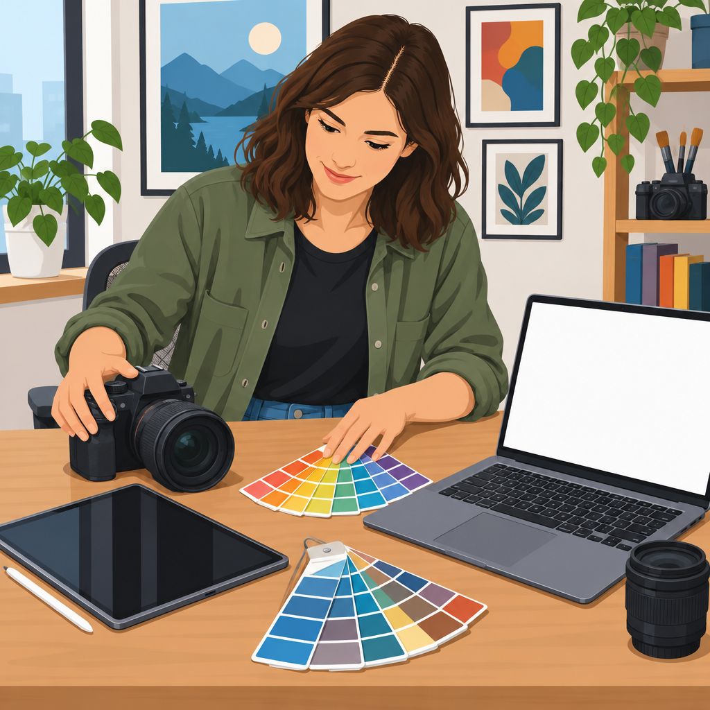
Examples of Emphasis in Multimedia Art
Several artistic examples demonstrate how emphasis can elevate visual and sensory experiences.
These works use focal points to direct attention and reinforce their central messages.
Consequently, emphasis helps audiences connect with different forms of multimedia expression.
- The Starry Night by Vincent van Gogh: The swirling sky attracts immediate attention.
- Hans Zimmer’s live performances: Dynamic lighting highlights important musical moments.
- Motion graphics in film advertisements: Bright logos and enlarged characters capture viewer interest.
- TeamLab’s Borderless: Bold colors and engaging patterns create focal points throughout the installation.
- Virtual reality experiences: Sound and visual cues direct attention toward important components.
Applying Emphasis for Lasting Artistic Impact
Emphasis plays a vital role in multimedia art.
Artists who master it can capture attention and communicate meaningful narratives.
Contrast, size variation, color isolation, and placement can produce memorable focal points.
As artists develop their skills, they can integrate these techniques more effectively.
This approach strengthens audience engagement and transforms simple pieces into memorable experiences.
With practice and creativity, multimedia artists can create captivating works that leave lasting impressions.
See Related Content: Educational Paths for Aspiring Brand Strategists
The Importance of Unity in Design
Unity creates a harmonious relationship among every element within a multimedia design.
When elements work cohesively, they produce a strong visual impact.
Transform Your Career Today
Unlock a personalized career strategy that drives real results. Get tailored advice and a roadmap designed just for you.
Start NowThis coherence helps viewers engage fully with the artwork.
Without unity, a piece may feel disjointed or chaotic.
Therefore, unity enhances clarity and helps communicate a clear message.
Why Unity Matters
Unity helps artists communicate specific emotions and themes.
It also strengthens the overall concept and encourages viewer engagement.
Several qualities explain why unity remains essential in multimedia art.
- Cohesion: Unity connects different elements and makes them feel like parts of a whole.
- Clarity: A unified design communicates its message more effectively.
- Focus: Unity guides the viewer’s eye toward important areas of the artwork.
- Visual Rhythm: Unity creates movement and helps the artwork flow smoothly.
- Emotional Impact: A cohesive design strengthens the artwork’s emotional resonance.
How Multimedia Artists Can Achieve Unity
Artists achieve unity through deliberate and consistent design choices.
These strategies establish coherence across different elements and media.
Careful planning allows each component to support the overall piece.
- Consistent Color Palette: A limited palette creates harmony and supports desired emotions.
- Repetition of Elements: Repeated shapes, lines, or textures reinforce continuity.
- Alignment of Visual Elements: Aligned components create visual connections throughout the piece.
- Balance of Visual Weight: Even distribution creates stability and supports cohesion.
- Clear Hierarchy: A clear hierarchy guides viewers through the artwork.
- Texture and Patterns: Similar textures and patterns unify diverse media elements.
Examples of Unity in Multimedia Art
Many multimedia artists demonstrate unity through carefully integrated design elements.
Examining these works can reveal how artists connect color, space, texture, and narrative.
The following examples show different approaches to creating cohesive multimedia experiences.
- “The Uprising” by Yoko Ono: Similar colors and themes create a cohesive narrative and emotional journey.
- “Reflections” by Olafur Eliasson: Light, color, and space combine to create a shared experience.
- “Weather Project” by Olafur Eliasson: A single color scheme reinforces unity throughout the exhibit.
- “Breathe” by Anish Kapoor: Repeated geometric shapes connect form and space.
- “A Subtlety” by Kara Walker: Repeated motifs and a shared narrative unify varied materials and themes.
Implementing Unity in Your Own Work
Begin your multimedia piece with a clear artistic vision.
Your intention can guide decisions about color, texture, arrangement, and emphasis.
Use the following steps to develop a cohesive and engaging artwork.
- Define Your Theme: Decide which message you want to communicate.
- Sketch Your Ideas: Use rough sketches to explore relationships among elements.
- Select a Cohesive Color Scheme: Choose colors that complement your theme.
- Utilize Texture: Select textures that support your theme and add visual depth.
- Balance Elements: Distribute visual weight carefully across the piece.
- Seek Feedback: Invite different perspectives to refine your artistic choices.
Unity gives multimedia art a cohesive narrative and strengthens audience connection.
When artists coordinate their choices, viewers can understand and experience the piece more fully.
Applying these strategies can produce more powerful and engaging multimedia art experiences.
Discover More: How to Write a Compelling Copy Editing Resume
Understanding Proportion in Design
Proportion describes the relationship between different elements in a design.
It determines how sizes and shapes relate to one another.
In multimedia art, accurate proportion creates harmony and visual order.
However, poor proportion can create disarray and discomfort within artwork.
Artists also use proportion to guide how viewers perceive their work.
For instance, a well-proportioned figure captures attention and invites admiration.
Conversely, an awkwardly sized element can distract viewers from the intended message.
The eye naturally seeks harmony, and proportion helps artists achieve it.
The Role of Proportion in Aesthetics
Proportion strongly influences the aesthetic quality of multimedia art.
Several effects explain its importance in visual composition.
- Balance: Proportion creates balanced relationships among elements, producing a pleasing composition.
- Hierarchical Structure: Proper proportion communicates importance and directs viewer attention effectively.
- Emphasis: Correctly sized elements highlight specific features and support the artwork’s narrative.
- Realism: Accurate proportions strengthen realism in figurative art and encourage viewer connection.
Artists can better understand proportion by applying it across several art forms.
A well-proportioned character may evoke empathy, while a poorly sized feature can create disbelief.
Maintaining Proper Proportions in Multimedia Arts
Multimedia artists should actively monitor proportions throughout the creative process.
The following techniques help artists maintain accurate relationships among visual elements.
- Reference Real-Life Proportions: Study real subjects through photographs or models to compare sizes and shapes.
- Use Grids: Apply digital grids to establish consistent relationships between elements.
- Explore the Golden Ratio: Study this mathematical principle, which artists have used for centuries.
- Practice with Sketching: Create rough drafts to visualize proportions and adjust designs early.
- Seek Feedback: Ask peers to identify disproportionate elements that you might overlook.
By adopting these techniques, artists can refine their work significantly.
These methods improve the visual quality of multimedia pieces when artists apply them carefully.
Examples of Excellent Use of Proportion
Examining exemplary multimedia pieces can reveal effective approaches to proportion.
The following examples demonstrate how artists use size relationships to support meaning.
- “Starry Night” by Vincent van Gogh: The swirling sky uses proportion to harmonize stars, moon, and landscape.
- “The Persistence of Memory” by Salvador Dali: Exaggerated timepieces amplify the theme of reality versus perception.
- “Avatar” by James Cameron: Pandora and its inhabitants demonstrate careful proportion, strengthening the immersive experience.
- “Hunger Games” Movie Posters: Proportionally scaled characters emphasize their roles and communicate the films’ themes.
- “Toy Story” by Pixar: Exaggerated character proportions enhance emotions and strengthen audience connection.
These examples show how successful artists and filmmakers use proportion to create compelling works.
When artists control proportion effectively, their work communicates with greater clarity.
Applying Proportion to Strengthen Visual Communication
Proportion remains a fundamental principle in multimedia art.
Transform Your Career Today
Unlock a personalized career strategy that drives real results. Get tailored advice and a roadmap designed just for you.
Start NowIt directly shapes harmony, realism, emphasis, and viewer perception.
Artists can maintain accurate relationships by using references, grids, sketches, and feedback.
Studying established artworks also helps artists recognize effective proportional choices.
As artists apply proportion thoughtfully, they can elevate creativity and strengthen visual communication.
You Might Also Like: Corporate Communication Trainer's Daily Responsibilities
Repetition as a Multimedia Design Tool
Repetition strategically duplicates visual elements across a page or composition.
This approach creates unity, organization, and a coherent visual language.
Multimedia artists use repetition to strengthen focal points and improve navigation.
Repeated elements can make creative work more engaging and easier to understand.
They also guide viewers through the composition while reinforcing its theme or message.
Like musical notes, recurring design elements establish rhythm and visual harmony.
Functions of Repetition in Multimedia Art
Repetition supports several important functions within multimedia artwork.
It helps audiences follow information, recognize patterns, and remember key ideas.
- Creating Rhythm: Repetition establishes a visual tempo and helps audiences anticipate information flow.
- Building Consistency: Repeated colors, fonts, and shapes create a cohesive design.
- Enhancing Focus: Recurring elements direct attention toward important concepts and key areas.
- Facilitating Comprehension: Familiar patterns help viewers understand relationships and navigate complex information.
Strategies for Applying Repetition Effectively
Artists can apply repetition through deliberate choices involving elements, patterns, structure, scale, and movement.
These strategies preserve clarity while allowing repeated features to support the overall composition.
- Choose Key Elements: Select colors, shapes, or typography that reflect the central theme.
- Establish Patterns: Arrange recurring textures, images, or layouts to communicate a specific feeling.
- Limit Variation: Keep repeated elements sufficiently similar to preserve coherence.
- Use Grids: Apply grid systems to maintain alignment and clarity throughout the composition.
- Experiment with Scale: Vary element sizes so larger features attract attention and smaller features provide support.
- Incorporate Movement: Animate repeated elements or transitions to maintain interest and highlight important areas.
- Combine with Contrast: Pair recurring elements with contrasting features to strengthen clarity and visual appeal.
Examples of Repetition Across Creative Media
Artists use repetition across animation, websites, film credits, and print media.
Each medium demonstrates how recurring features can improve clarity and emotional connection.
- Animation Series: Repeated character situations reinforce personality and create rhythmic storytelling.
- Website Design: Recurring navigation patterns help users move through a site confidently.
- Film Credits: Repeated audio and visual motifs strengthen themes and evoke audience emotion.
- Print Media: Repeated column layouts create structured reading flows and support smooth information absorption.
These examples show how repetition operates across different creative formats.
Artists can study those applications to strengthen communication and engagement within their own projects.
Repetition as a Foundation for Memorable Artwork
Repetition gives multimedia designs rhythm, consistency, and focus.
Strategic recurrence strengthens communication and helps audiences remember important ideas.
Artists can repeat colors, shapes, layouts, or movements to create cohesive experiences.
Mastering this principle expands an artist’s creative toolbox and supports more compelling visual storytelling.
Applying Design Principles in Multimedia Art
Design principles give multimedia artists a practical framework for developing clear and engaging visuals.
This framework helps artists organize ideas and communicate messages more effectively.
Moreover, thoughtful structure can make visual experiences easier for audiences to understand.
Artists can strengthen their projects by combining rhythm, alignment, and intentional visual relationships.
These choices help each component support the larger purpose of the artwork.
Additionally, design principles encourage artists to explore fresh techniques and creative approaches.
Experimentation allows them to discover solutions that suit different multimedia project requirements.
As artists test new methods, they can expand their skills and adapt more confidently.
Regular evaluation also helps artists recognize opportunities for improvement.
They can review their work and identify areas that need stronger organization or clarity.
Feedback from peers and mentors can provide useful perspectives during this process.
Consequently, artists can refine their decisions and develop more effective creative habits.
Continued practice turns design knowledge into a dependable part of the artistic process.
Over time, artists can produce multimedia work that communicates clearly and connects with audiences.
Curiosity and experimentation keep the creative process active and productive.
By applying these principles consistently, artists can pursue greater control, flexibility, and artistic growth.
Additional Resources
Google search results for Essential Design Principles for Multimedia Artists Media and Communication
Transform Your Career Today
Unlock a personalized career strategy that drives real results. Get tailored advice and a roadmap designed just for you.
Start NowBing search results for Essential Design Principles for Multimedia Artists Media and Communication


