




Understanding the Importance of Color in Web Design
Color plays a crucial role in web design.
It shapes users’ first impressions and emotional responses.
Effective choices strengthen brand identity and improve usability.
What Is Color Theory?
Color theory studies how colors interact and influence one another.
It offers guidelines for combining colors into pleasing palettes.
The color wheel shows primary, secondary, and tertiary colors.
How Color Theory Influences User Experience
Color theory guides attention and encourages specific user actions.
Warm colors, including red and yellow, can evoke energy and excitement.
In contrast, cool colors such as blue and green can create calm and trust.
Strategic color choices can improve readability and navigation.
High contrast between text and backgrounds enhances legibility.
Similarly, color coding organizes information and guides users through websites.
Creating Emotional Connections Through Color
Colors carry psychological meanings that shape user perceptions.
For instance, blue often represents professionalism and reliability.
Therefore, corporate websites frequently use blue in their designs.
Conversely, vibrant colors can attract younger audiences and communicate creativity.
Establishing a Strong Brand Identity
A consistent color palette reinforces brand identity across digital platforms.
Coca-Cola and Starbucks use distinct color schemes that support recognition.
These consistent colors help users recognize each brand.
They also build familiarity and trust among users.
Using Color to Improve Engagement and Conversions
Thoughtful color choices can significantly enhance the user experience.
Designers should consider emotional effects when selecting colors.
They should also align color choices with brand messaging.
Ultimately, strategic colors can support stronger engagement and conversions.
Understanding the Basics of Color Theory
Color theory provides a framework for selecting and combining colors in web design.
It explains how colors interact and influence viewer perception.
Designers can use these principles to create harmonious visual experiences.
The Color Wheel
The color wheel visually represents colors and their relationships.
It divides colors into primary, secondary, and tertiary categories.
The wheel also helps designers identify relationships among colors.
- Primary Colors: Red, blue, and yellow cannot result from mixing other colors.
- Secondary Colors: Green, orange, and purple result from mixing two primary colors.
- Tertiary Colors: These colors combine a primary color with a secondary color.
Understanding the wheel helps designers create visually appealing color combinations.
These relationships support harmonious designs that capture users’ attention.
The Meaning and Psychology Behind Different Colors
Color psychology guides choices that match a design’s intended message.
Colors can evoke distinct emotions and responses.
Designers should consider these associations when selecting hues for specific audiences.
- Red: Red represents energy, passion, and urgency while encouraging action.
- Blue: Blue symbolizes trust, calmness, and stability for corporate websites.
- Green: Green suggests nature, growth, and tranquility for health-focused sites.
- Yellow: Yellow evokes happiness and optimism but requires careful use.
- Black: Black signifies elegance, sophistication, and authority in luxury designs.
- White: White represents cleanliness and simplicity while providing a neutral backdrop.
Thoughtful color selection can strengthen audience connections.
It can also improve engagement and user satisfaction.
Successful Web Designs Using Color Effectively
Several websites demonstrate how color choices can support user experience.
These designs use color to create recognizable and inviting visual identities.
Each example applies color differently while maintaining a clear design direction.
Transform Your Career Today
Unlock a personalized career strategy that drives real results. Get tailored advice and a roadmap designed just for you.
Start Now- Airbnb: Airbnb uses soft hues and white space to create an inviting atmosphere.
- Dropbox: Dropbox combines blue and white to suggest trust and professionalism.
- Spotify: Spotify uses vibrant green against dark backgrounds to emphasize calls-to-action.
- Mailchimp: Mailchimp uses vibrant yellow and playful typography to create an approachable identity.
- Apple: Apple uses white space and monochromatic colors to highlight product elegance.
These examples show how color choices can guide attention and shape brand perception.
Effective palettes create memorable visuals that remain with users after their visits.
Designers can communicate intended messages more clearly through deliberate color use.
How Color Contrast Supports Web Design
Color contrast describes the difference between two colors within a design.
It improves visibility, legibility, and the overall user experience on a website.
When designers apply contrast effectively, it captures attention and supports clearer navigation.
- Enhances readability: Strong contrast between text and backgrounds makes content easier to read.
- Guides attention: Designers can highlight calls to action, headlines, and buttons.
- Establishes hierarchy: Different contrast levels guide users through website content.
- Aids accessibility: Suitable contrast helps users with visual impairments interact with content.
Using Contrast to Emphasize Key Elements
Contrast directs attention toward important parts of a webpage.
Designers can use contrasting colors to make essential content easier to notice.
Strategic contrast also supports interaction and can encourage stronger engagement.
- Calls to action: Bright orange or green buttons can stand out against neutral backgrounds.
- Headlines: Large, bold text with contrasting color draws attention to important titles.
- Links: Underlined links with contrasting shades help users identify interactive content.
- Images: Contrasting colors around images can focus attention on visual content.
Practices for Effective Color Contrast
Effective contrast requires deliberate choices throughout the design process.
Designers should evaluate color combinations, readability, accessibility, and viewing conditions.
These considerations help create interfaces that remain clear and visually coherent.
Choosing a Suitable Color Scheme
Begin with a color scheme that supports visual harmony and clear communication.
Color tools such as Adobe Color and Coolors can help create coordinated palettes.
Select a primary color and a contrasting secondary color that support the brand identity.
- Use Adobe Color or Coolors to create harmonious color palettes.
- Choose a primary color and a contrasting secondary color for visual coherence.
- Align the selected colors with the brand identity and audience preferences.
Testing Contrast Ratios
Contrast testing shows whether text and interactive elements remain easy to distinguish.
The WebAIM Contrast Checker can assess combinations before publication.
Testing both text and controls helps maintain consistent visibility across the interface.
- Use the WebAIM Contrast Checker to assess color combinations.
- Maintain a ratio of at least 4.5:1 for normal text.
- Maintain a ratio of 3:1 for large text.
- Test buttons and interactive elements against their backgrounds.
Considering Different User Environments
Users may view websites in bright or dim surroundings.
Designers should account for changing lighting conditions when selecting colors.
They should also consider users who experience color blindness.
- Design for readability in bright and dim lighting conditions.
- Choose high-contrast combinations for outdoor clarity.
- Select colors that users with color blindness can differentiate.
Using White Space to Strengthen Contrast
White space separates content and gives contrasting colors room to stand out.
Spacing around text and controls can improve readability.
Less visual crowding allows users to recognize important elements more easily.
- Place white space around text and interactive elements.
- Use open space to strengthen the perceived contrast between colors.
- Avoid overcrowding elements because clutter can weaken contrast.
Following Accessibility Standards
Accessibility standards help designers create content that serves a wider range of users.
WCAG provides guidance for improving access to web content.
Regular audits can reveal contrast and usability issues that require attention.
- Follow the Web Content Accessibility Guidelines for accessible design.
- Provide text alternatives for images to support users with disabilities.
- Run accessibility audits regularly to identify areas for improvement.
Creating Clearer and More Accessible Web Experiences
Color contrast strengthens readability, navigation, and visual emphasis in web design.
Thoughtful contrast helps users understand content and interact with important elements.
By combining contrast testing, white space, and accessibility practices, designers can create clearer websites.
Uncover the Details: Career Path for Influencer Relations Specialists
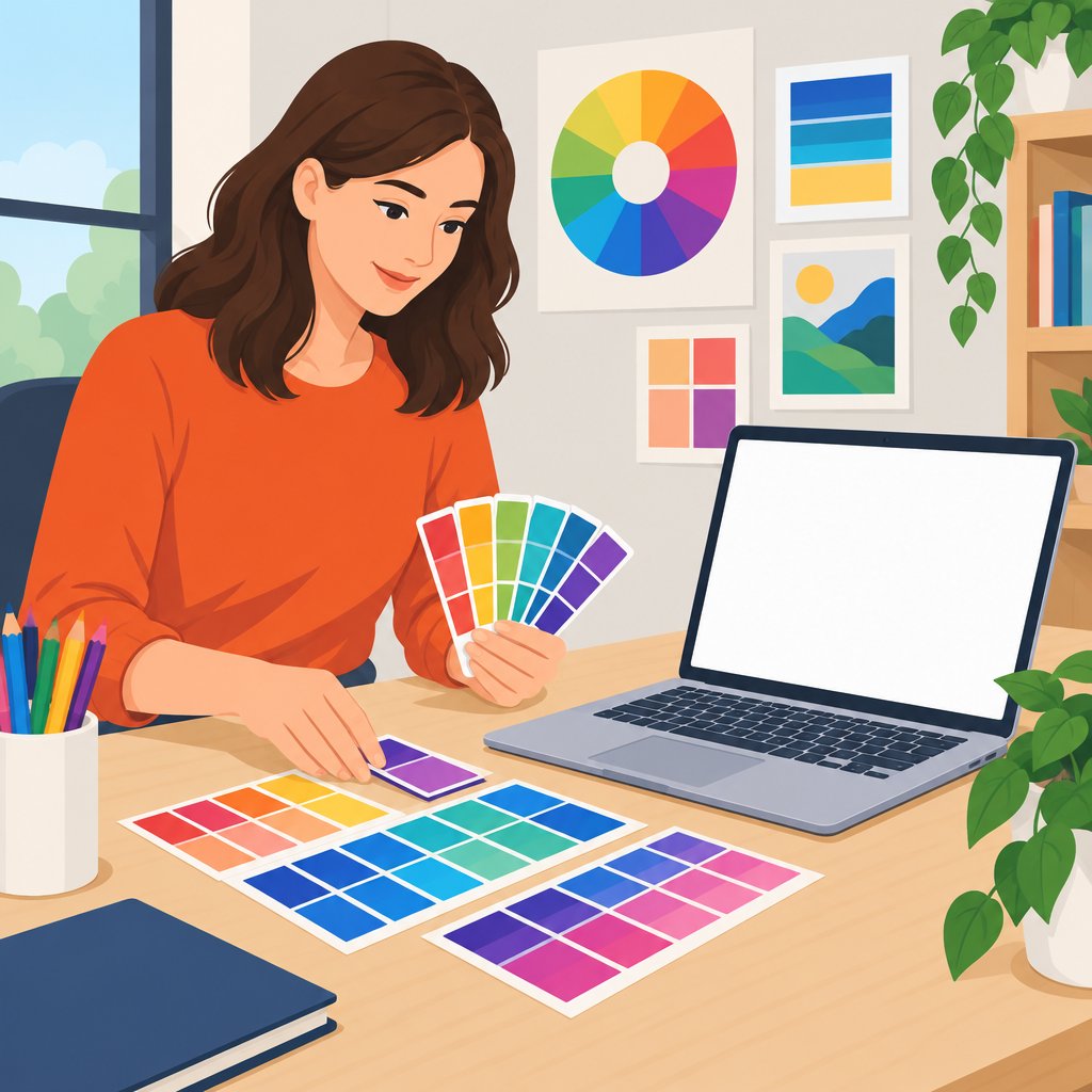
Understanding Color Harmony in Web Design
Color harmony creates a pleasing arrangement of colors.
It establishes balance and visual stability within a design.
In web design, harmony supports a cohesive and attractive user experience.
A harmonious scheme can evoke emotions, guide interactions, and improve overall aesthetics.
Benefits of Color Harmony
Color harmony influences how users perceive a website.
A well-harmonized design can improve readability and comprehension.
It can also support engagement, retention, brand representation, and emotional connections.
- Enhanced readability and comprehension
- Improved user engagement and retention
- Effective brand representation and messaging
- Stronger emotional connections with users
Types of Color Schemes
Different color schemes help designers create harmonious visual experiences.
Each scheme arranges colors according to their positions on the color wheel.
Transform Your Career Today
Unlock a personalized career strategy that drives real results. Get tailored advice and a roadmap designed just for you.
Start NowDesigners can select a scheme based on the desired balance, energy, or visual comfort.
Complementary Color Scheme
This scheme uses colors positioned opposite each other on the color wheel.
The contrast creates a vibrant and energetic appearance.
Blue and orange, along with red and green, form complementary pairs.
Designers can use these colors to highlight important elements.
However, excessive contrast can overwhelm viewers, so designers should maintain balance.
Analogous Color Scheme
An analogous scheme combines colors that sit next to each other on the color wheel.
This selection creates a harmonious and serene appearance.
Blue, blue-green, and green create one cohesive palette.
Designers often use analogous colors to establish a unified aesthetic.
This scheme works well for backgrounds and large areas.
Triadic Color Scheme
A triadic scheme combines three equally spaced colors on the color wheel.
This method creates balance while introducing visual variety.
Red, yellow, and blue form a classic triadic scheme.
Triadic colors preserve vibrance while supporting harmony.
Different shades and tints can further enhance the selected scheme.
Practical Methods for Achieving Color Harmony
Achieving color harmony requires a thoughtful design approach.
Designers should understand color relationships before selecting a palette.
They should also evaluate how colors guide attention and support accessibility.
- Start with a Color Wheel: Familiarize yourself with primary, secondary, and tertiary colors.
- Limit Your Palette: Choose three to five main colors to prevent visual chaos.
- Utilize Shade and Tint Variations: Apply variations to add depth and maintain visual interest.
- Create a Visual Hierarchy: Use brighter colors to highlight headings and call-to-action buttons.
- Test for Accessibility: Choose sufficient contrast to improve visibility for users with visual impairments.
- Seek Inspiration: Explore Dribbble and Behance for examples of innovative color use.
- Conduct User Testing: Observe interactions and collect feedback to refine color choices.
- Consider Brand Colors: Align the palette with the brand’s identity, values, and personality.
Common Color Design Mistakes
Designers should recognize common mistakes when developing harmonious color schemes.
Excessive color can dilute a message and confuse users.
Weak contrast can make text unreadable and frustrate visitors.
- Overloading with Colors: Using too many colors can dilute the message and confuse users.
- Ignoring Color Psychology: Neglecting psychological effects can weaken connections with users.
- Neglecting Contrast: Inadequate contrast can make text unreadable and frustrate visitors.
- Forgetting Mobile Responsiveness: Ensure colors appear effectively across different devices.
Color Harmony’s Role in Effective Web Design
Color harmony supports cohesive, visually appealing, and effective user experiences.
Understanding color schemes helps designers create interfaces that resonate with users.
Careful color choices can strengthen engagement while conveying brand messages effectively.
You Might Also Like: Exploring the Hero's Journey in Screenwriting
The Impact of Color on User Perception
Color influences how users perceive and interact with websites.
It affects emotions, behavior, and decision-making during digital experiences.
Designers can create more effective websites by considering psychological and cultural influences.
How Color Influences User Emotions and Behavior
Colors can evoke many emotional responses in website visitors.
These responses can influence how visitors view a brand or website.
Color choices can also encourage specific actions during website navigation.
- Red: Red represents passion and urgency.
- It can encourage quick decisions, such as making a purchase.
- Blue: Blue conveys trust and calmness.
- Corporate and financial websites often use blue to foster reliability.
- Green: Green symbolizes growth and health.
- Eco-friendly and wellness brands can use green effectively.
- Yellow: Yellow evokes happiness and positivity.
- Designers should use yellow carefully because it can overwhelm users.
- Purple: Purple suggests luxury and creativity.
- It can appeal to affluent audiences and artistic sectors.
- Black: Black implies sophistication and elegance.
- Fashion and luxury brands can use black to reinforce those qualities.
- White: White represents simplicity and cleanliness.
- It helps create an uncluttered and professional appearance.
Color also affects behavior beyond emotional responses.
A contrasting button can direct attention toward an important action.
This design choice can lead to higher click-through rates.
Cultural Differences in Color Perception
People from different cultures may interpret colors in significantly different ways.
A color that feels positive in one culture may seem negative elsewhere.
Designers should research cultural meanings before selecting colors for global audiences.
- Red: Western cultures may associate red with danger or love.
- In China, red represents good fortune and joy.
- White: Western traditions often connect white with purity and innocence.
- Many Asian cultures associate white with mourning and funerals.
- Green: Green often represents life and regeneration.
- Some Middle Eastern cultures also consider green sacred.
- Blue: Western societies often associate blue with tranquility and serenity.
- Some Middle Eastern cultures connect blue with protection and safety.
Ignoring these cultural differences can create costly miscommunications.
Companies targeting global audiences should study color symbolism within each market.
Transform Your Career Today
Unlock a personalized career strategy that drives real results. Get tailored advice and a roadmap designed just for you.
Start NowThoughtful research helps designers choose colors that communicate appropriate meanings.
Case Studies in Effective Web Color Use
Existing websites demonstrate how color can evoke specific emotions.
These examples show how palettes can support brand identity and audience expectations.
They also illustrate how color choices can shape user experiences.
- Airbnb: Soft, warm colors create a welcoming atmosphere.
- Red and coral hues suggest warmth and hospitality.
- Spotify: Green and black create a fresh, modern impression.
- Green suggests vitality and energy for music lovers.
- The high contrast also improves interface readability.
- Netflix: Black conveys sophistication and mystery.
- Red attracts attention and encourages interaction with content.
- Whole Foods: Earthy colors reinforce natural and organic associations.
- Greens, browns, and beiges support its health-focused grocery identity.
These examples show that designers should select colors intentionally.
Effective palettes should align with brand identity and desired emotional responses.
Strategic color use can make a website more compelling than a merely functional design.
Strategic Color Choices for Web Design
Color psychology can help designers improve user experiences.
Cultural awareness can help teams avoid confusing or inappropriate messages.
When designers use color strategically, websites can guide behavior and communicate meaning more effectively.
Delve into the Subject: Top Challenges Faced by Television Producers Today
Accessibility Considerations in Web Design
Accessibility in web design plays a crucial role in today’s digital landscape.
Many users experience color blindness or visual impairments.
Therefore, designers must consider these challenges when creating websites.
Ignoring accessibility can alienate a significant user base.
This section discusses color accessibility and outlines practical best practices.
Understanding Color Blindness and Visual Impairments
Color blindness affects approximately one in twelve men and one in two hundred women worldwide.
It often involves difficulty distinguishing between specific colors.
Common types include the following:
- Protanopia: Difficulty with red colors.
- Deuteranopia: Difficulty with green colors.
- Tritanopia: Difficulty with blue colors.
Visual impairments encompass a range of conditions, including the following:
- Low vision limits visual acuity and can affect usability.
- Blindness requires alternative navigation methods.
- Color sensitivity affects responses to bright colors.
Ignoring these conditions can create barriers for users.
Engaging with your site can become a frustrating experience.
Consequently, poor accessibility can reduce user satisfaction and retention rates.
Inclusive design principles help address these issues.
Ensuring Accessible Web Content
Creating accessible web content demands a thoughtful approach.
Designers can apply several essential techniques.
Use High Contrast Colors
Choose color combinations that provide sufficient contrast.
High contrast improves readability and navigation.
Tools such as the WebAIM Contrast Checker help evaluate color combinations.
Avoid Color-Dependent Information
Avoid using color alone to communicate information.
Instead, pair colors with text labels or symbols.
This approach helps users with color blindness understand the content.
Implement Text Alternatives
Provide text alternatives for non-text content.
Use alt text for images and descriptive captions for video content.
This guideline benefits users who rely on screen readers.
Use a Flexible Layout
Design layouts that adapt to various visual impairments.
Transform Your Career Today
Unlock a personalized career strategy that drives real results. Get tailored advice and a roadmap designed just for you.
Start NowResponsive designs allow users to adjust font size and spacing.
This flexibility enhances usability across devices.
Conduct Testing and Gather Feedback
Conduct usability testing with individuals who have color blindness or low vision.
Feedback from real users helps identify accessibility gaps.
Testing reveals how effectively the design conveys desired information.
Tools and Resources for Accessible Color Palettes
Several tools can help designers create accessible color palettes.
Using these resources can improve web accessibility.
Color Contrast Checkers
Use tools such as the following:
Color Palette Generators
Palette generators assist with selecting harmonious colors.
Color Blindness Simulators
Simulators help designers visualize how colorblind users may see their designs.
Accessibility Guidelines
Established guidelines provide further accessibility insights.
Designers bear responsibility for creating enjoyable and inclusive experiences.
Accessibility benefits users with impairments and improves usability for everyone.
Prioritizing accessible design fosters a welcoming space for all users.
Investing time in color theory and accessibility guidelines can encourage greater engagement and loyalty.
Learn More: The Future of Advertising Copywriting
Current Trends in Color Usage in Web Design
Digital designers continue exploring fresh color schemes and palettes.
These choices create innovative aesthetics that capture user attention.
Current trends show how color continues shaping modern web experiences.
Bold and Unique Color Schemes
Designers increasingly choose vibrant colors that stand apart from conventional palettes.
These schemes can create strong visual energy and guide user attention.
They also help websites communicate distinctive personalities.
- High Contrast: Designers combine contrasting colors to improve readability and emphasize important elements.
- Vivid Saturation: Bright, saturated colors create energetic interfaces that often attract younger audiences.
- Layering Colors: Designers layer colors within gradients to add depth and create modern visual effects.
- Accent Colors: A bold accent color can highlight calls to action and navigational elements.
Gradients and Duotone Effects
Gradients have returned as a prominent feature in contemporary web design.
Designers use them to add movement and visual depth to page backgrounds.
Duotone treatments also create distinctive and engaging visual experiences.
- Soft Transitions: Gradients create smooth movement between colors and support modern appearances.
- Brand Identity: A consistent gradient palette can strengthen a brand’s visual identity.
- Eye-Catching Alerts: Gradients can draw attention to news, notifications, and other important information.
Dark Mode Aesthetics
Dark mode remains popular across many user interfaces.
Designers now optimize color palettes specifically for darker backgrounds.
Brighter colors often stand out more clearly against these darker surfaces.
- Reduced Eye Strain: Dark mode may feel easier to view in low-light environments.
- Power Efficiency: Dark themes can use less power on OLED screens.
- Modern Appeal: Many users appreciate dark themes for their sleek and contemporary appearance.
Pastel and Muted Tones
Pastel and muted tones offer an alternative to highly saturated color schemes.
They create calm interfaces with sophisticated and minimal visual qualities.
These palettes work especially well when designers want a restrained appearance.
- Subtle Elegance: Pastel colors convey delicacy and suit lifestyle or wellness websites.
- Timeless Quality: Muted colors create classic aesthetics that resist quick visual aging.
- Versatility: Pastels pair effectively with bold accents and help balance stronger visual elements.
Experiments with Color Psychology
Designers increasingly apply color psychology when selecting website palettes.
They connect specific colors with desired emotional impressions and actions.
This approach can make digital experiences feel more intentional and responsive.
- Blue for Trust: Financial institutions often use blue to communicate trust and reliability.
- Red for Urgency: E-commerce websites may use red to encourage immediate action.
- Green for Growth: Eco-friendly brands often use green to represent growth and health.
Innovative Websites Leading the Way
Several well-known websites demonstrate effective and distinctive color choices.
Transform Your Career Today
Unlock a personalized career strategy that drives real results. Get tailored advice and a roadmap designed just for you.
Start NowEach example combines color with typography, spacing, and brand expression.
These approaches show how carefully selected palettes can support different website experiences.
- Stripe: Stripe combines vibrant colors with clear typography to express innovation and sophistication.
- Airbnb: Airbnb uses bold accents against white backgrounds to create an inviting experience.
- Dropbox: Dropbox integrates gradients to strengthen its modern visual appeal.
- Medium: Medium uses muted tones to establish a comfortable reading environment.
Adapting Color Strategies for Modern Websites
Color trends continue influencing how designers build digital experiences.
Bold palettes, gradients, dark modes, and muted tones each offer different creative possibilities.
Designers can study current examples and adapt suitable approaches for their own websites.
As visual preferences change, flexible color strategies can help websites remain engaging and relevant.
Strategic Color Decisions for Web Design
This post examined color theory’s role in effective web design.
It showed how color choices can guide user behavior.
Thoughtful palettes can support user experience across digital platforms.
Color decisions also affect usability, not only appearance.
Warm colors often create excitement.
Cool colors can promote calmness.
Therefore, designers can use these responses to guide visitor actions.
Complementary colors create vibrant visuals.
Meanwhile, analogous colors provide cohesive results.
Designers should select combinations that maintain engagement without overwhelming users.
A considered palette can shape brand perception.
It can also communicate core values quickly.
As projects develop, teams should assess colors against their audiences.
They can then select tones that resonate with intended visitors.
Finally, teams can test different schemes during design exploration.
This process can make websites more appealing and functional.
Additional Resources
Google search results for The Role of Color Theory in Effective Web Design Media and Communication
Bing search results for The Role of Color Theory in Effective Web Design Media and Communication


