Introduction
Color plays a vital role in animation projects.
It not only beautifies visuals but also shapes narratives.
Animators can communicate themes and emotions through smart color choices.
Each shade and hue can evoke different feelings.
Color guides the audience’s experience.
Effective use of color enhances storytelling significantly.
Consider how warm colors such as red and orange create a sense of warmth or urgency.
In contrast, cooler colors like blue introduce calm or sadness.
The right color palette can anchor a narrative.
This allows audiences to connect on a deeper emotional level.
Moreover, color can set the tone for the entire project.
A bright, vibrant scheme often suggests excitement and joy.
Alternatively, a muted palette might convey melancholy or nostalgia.
Animators can manipulate color to foreshadow events or highlight key moments in the story.
Color can also differentiate characters and their arcs.
Distinct color schemes signal personality traits or development.
For example, a character in warm tones may exude confidence.
One in cooler colors might appear introverted.
These visual cues become tools for audience engagement.
They help viewers follow the story easily.
Furthermore, color can build tension and suspense.
Dark colors and shadows create an ominous atmosphere.
Sudden changes in color make viewers feel startled or anxious.
This enhances dramatic moments in the plot.
This strategic manipulation reinforces emotional stakes.
It keeps viewers invested.
Lastly, color consistency holds significant importance.
A coherent color palette throughout animation creates a unified visual identity.
This consistency helps audiences immerse themselves in the narrative.
Ultimately, the effective use of color in animation shapes how stories unfold.
It helps stories resonate with viewers.
Understanding Color Theory
Color theory serves as the foundation for effective visual communication.
It explains how colors work individually and in combination.
Successful animation projects leverage color theory to convey emotions.
They also set moods and enhance storytelling.
Basics of Color Theory
Color theory encompasses three main elements: the color wheel, color harmony, and color context.
Understanding these components is pivotal for animators.
- Color Wheel: This circular diagram visually represents colors, helping artists grasp their relationships.
- Primary Colors: Red, blue, and yellow are the building blocks of all other colors.
- Secondary Colors: Green, orange, and purple result from mixing primary colors.
- Tertiary Colors: These colors come from mixing primary and secondary colors, such as red-orange.
Applying Color Theory in Animation Projects
Applying color theory allows animators to evoke specific emotional responses.
Animators can make informed choices about colors to support the narrative.
- Creating Contrast: High contrast in colors makes elements stand out, directing viewers’ attention effectively.
- Establishing Mood: Colors convey different emotions. Utilize this to express feelings and themes.
- Color Symbolism: Colors often carry cultural meanings. Understanding these helps convey the right message.
The Color Wheel and Color Schemes
The color wheel is an essential tool for designers.
Transform Your Career Today
Unlock a personalized career strategy that drives real results. Get tailored advice and a roadmap designed just for you.
Start NowIt helps in selecting harmonious color combinations for animations.
Color Schemes
- Monochromatic: Different shades of a single color create a harmonious and cohesive look.
- Analogous: Colors next to each other on the wheel form a soothing effect when used together.
- Complementary: Opposing colors create vibrant visuals but should be used carefully to avoid overwhelming viewers.
- Triadic: This scheme uses three colors evenly spaced on the color wheel.
Creating Moods and Atmospheres
Different colors can create various moods and atmospheres in animations.
Understanding these effects enables animators to enhance storytelling.
Examples of Colors and Their Associated Moods
- Red: Associated with passion, excitement, and danger.
- Bright reds can energize. Darker reds may evoke anger.
- Blue: Often signifies calmness, trust, and sadness.
- Lighter shades create tranquility, while dark blues suggest authority.
- Yellow: Represents happiness, optimism, and warmth.
- It can energize scenes but may overwhelm in excess.
- Green: Symbolizes nature, growth, and rebirth.
- Rich greens evoke luxury, while lighter shades suggest freshness.
- Purple: Associated with creativity, mystery, and spirituality.
- Lighter purples feel romantic, while dark purples can signify wealth.
Impact of Color Usage in Notable Animation Examples
Exploring well-known animation examples reveals how color transforms storytelling.
- Inside Out: The use of bright colors for Joy contrasts with muted representations of Sadness.
- This contrast illustrates emotional highs and lows effectively.
- Frozen: Icy blues emphasize Elsa’s emotional journey and isolation.
- Warmer colors are associated with Anna’s character, highlighting their differences.
- Up: The vibrant color palette of the house and balloons symbolizes adventure.
- This contrasts with the dull surroundings of Carl’s life.
Practical Guidelines for Effective Color Use in Animation
Understanding color theory is crucial for animators.
Here are practical tips for incorporating color effectively:
- Limit Your Palette: A focused color palette creates cohesiveness and stronger storytelling.
- Test Different Combinations: Experiment with various schemes to see what elicits the desired mood.
- Consider Your Audience: Tailor your color choices to engage your target demographic effectively.
- Study Nature and Art: Observing how colors interact in the world around us inspires creative choices.
- Utilize Color Psychology: Research how color impacts emotions to guide your palette decisions.
The Role of Color Theory in Enhancing Animated Narratives
Understanding color theory provides animation projects with a strong visual foundation.
By applying color principles, animators create engaging narratives and emotional connections.
Thoughtful color choices help animation resonate deeply with its audience and leave lasting impressions.
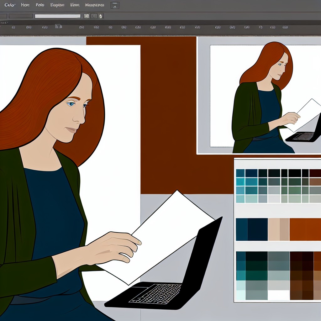
When embarking on an animation project, one of the crucial aspects to consider is the creation of a color palette.
A well-designed color palette can enhance storytelling and evoke emotions effectively.
This section outlines the process of selecting a color palette, the importance of consistency in color choices, and tips for creating a harmonious palette that complements the narrative and characters.
The Process of Selecting a Color Palette
Choosing a color palette requires thoughtful consideration and creativity.
Here is a step-by-step approach to help you in this process:
- Understand Your Story: Start by analyzing the core themes of your project.
- Determine what emotions you want to convey and how color can amplify these feelings.
- Research and Inspiration: Gather inspiration from various sources, including existing artworks, films, and nature.
- Create a mood board that encapsulates the feelings and visuals you want to portray.
- Select Your Base Colors: Choose a few base colors that reflect the overall mood of your story.
- Typically, you might want to choose three to five primary colors that will dominate the palette.
- Experiment with Variations: Adjust the saturation, brightness, and hue of your base colors.
- Create lighter and darker shades to enhance depth and variety in your scenes.
- Create Color Swatches: Develop swatches for each color and observe how they interact with one another.
- This step helps identify which colors harmonize best together.
- Test in Different Contexts: Apply your color palette to different scenes and characters.
- This helps you see how the colors perform in various lighting and backgrounds.
This methodical approach allows animators to thoughtfully select colors that will align with their creative vision and the storytelling elements at play.
The Importance of Consistency in Color Choices
Consistency in color choices is vital for creating a cohesive animation.
Here is why maintaining uniformity matters:
- Establishes Visual Identity: A consistent color palette helps develop a distinct visual style for your project.
- Viewers can quickly identify your animation by the colors you use.
- Aids Storytelling: Uniform color schemes assist in emphasizing the emotional tone of the scenes.
- Consistency supports the narrative flow and reinforces the atmosphere.
- Enhances Character Recognition: When characters maintain consistent color schemes, they become more recognizable.
- This fosters a deeper connection between characters and audiences.
- Improves Visual Harmony: A cohesive color palette ensures that elements within the animation look harmonious together.
- This reduces visual clutter, allowing viewers to focus on the narrative.
- Facilitates Animation Process: Consistency streamlines the animation process.
- It reduces the chances of color-related errors and simplifies collaborative efforts among team members.
By ensuring that color choices remain consistent throughout your project, you cultivate a stronger emotional impact and provide a seamless viewing experience.
Tips for Creating a Harmonious Color Palette
A harmonious color palette can bring your animation project to life.
Here are some tips to achieve visual harmony:
- Use Color Theory: Familiarize yourself with color theory concepts such as complementary colors, analogous colors, and triadic color schemes.
- These theories can guide your color selection process.
- Limit Your Palette: Avoid overwhelming your audience with too many colors.
- Stick to a limited palette to maintain harmony and focus.
- Consider Cultural Context: Be mindful of the cultural meanings behind colors.
- Different cultures may perceive colors in diverse ways, affecting audience interpretation.
- Emphasize Key Elements: Use color strategically to draw attention to essential characters or objects.
- Bright or contrasting colors can highlight focal points within scenes.
- Balance Warm and Cool Colors: Ensure a mix of warm and cool colors to create depth and interest.
- Warm colors evoke energy, while cool colors provide calmness.
- Test and Iterate: Always be willing to adjust your palette during the animation process.
- Testing colors in various scenes may lead to unexpected yet harmonious combinations.
These tips will help ensure that your color palette not only looks good but also enhances the overall narrative and emotional journey of your animation.
Creating an effective color palette is an essential part of the animation process.
By understanding your story, ensuring consistency in color choices, and employing techniques to create harmony, you elevate the quality of your animation.
Remember, the right colors can captivate your audience, bring characters to life, and convey emotions that words alone cannot express.
Embrace the power of color to enhance your animation projects and engage viewers on a deeper level.
See Related Content: Legal Considerations for Podcast Production
Color plays a crucial role in animation.
It helps to evoke feelings and enhances storytelling.
When used effectively, color can transform a simple story into a rich emotional journey.
Different colors express various emotions and can significantly influence audience interpretation.
Using Color to Convey Emotions
Colors have specific meanings and convey distinct emotions.
Understanding these associations can change how audiences perceive a narrative.
Here are some common emotions linked to specific colors:
- Red: Often symbolizes passion, love, or anger.
- Blue: Represents calmness, sadness, or tranquility.
- Yellow: Associated with happiness, optimism, and energy.
- Green: Symbolizes nature, growth, and renewal.
- Purple: Often connected to creativity, luxury, and mystery.
- Black: Represents sophistication, power, but also can convey sorrow and mystery.
- White: Symbolizes purity, innocence, and simplicity.
Animation can leverage these emotional associations.
A scene depicting a tragic moment may use gray or dark colors to emphasize sadness.
Conversely, a joyful celebration scene might unleash vibrant yellow and greens to enhance the feeling of happiness.
The Psychological Effects of Colors
Colors trigger psychological reactions in viewers.
Understanding these reactions allows animators to create targeted emotional responses.
Here are some ways colors affect viewer emotions:
- Attention-Grabbing: Bright, high-contrast colors catch the viewer’s eye.
- Subconscious Influence: Color choices can affect mood and feelings.
- Emotional Connection: Color palettes can create emotional resonance.
- Symbolism: Colors can symbolize various themes or messages.
Artists can manipulate audience feelings through color psychology.
Transform Your Career Today
Unlock a personalized career strategy that drives real results. Get tailored advice and a roadmap designed just for you.
Start NowFor instance, they may prefer cool blues and greens in a somber scene to evoke sadness.
Or, they might use bold yellows and reds to evoke excitement and joy in a climactic moment.
Examples of Emotional Color Use in Popular Animations
Many successful animations effectively use color to enhance storytelling.
Let’s explore examples that convey emotions through clever color usage:
- Inside Out: This film beautifully illustrates emotions through colors.
- Each emotion—joy, sadness, anger, fear, and disgust—is represented by a distinct color.
- Yellow represents joy, blue signifies sadness, and red exemplifies anger.
- The character designs and surroundings change color based on emotional states.
- This enhances the audience’s connection to the story.
- Up: The bright colors of the balloon scene symbolize hope and adventure.
- The warm palette creates a sense of joy as characters embark on their journey.
- In contrast, the opening scene uses muted colors to evoke sadness and loss.
- Frozen: The icy landscape utilizes cool blues to convey loneliness and isolation.
- This reflects Elsa’s emotional state.
- As the story develops, warmer colors emerge to symbolize connection and love.
- This is especially true during “Love is an Open Door.”
- WALL-E: The use of a contrasting color palette highlights environmental themes.
- The bleak, gray world contrasts with the bright colors associated with WALL-E.
- This represents hope and compassion.
- Color choice helps drive the narrative about love versus consumerism.
- Coco: This film uses vibrant colors to celebrate life and culture.
- The Day of the Dead theme is expressed through vivid colors.
- These evoke joy in remembrance and connection.
- The emotional range achieved through color enhances the narrative massively.
These animations demonstrate color’s power in storytelling.
By carefully choosing color palettes, filmmakers can guide emotional experiences.
They craft rich narratives that resonate deeply with audiences.
Enhancing Storytelling Through Color Psychology
Incorporating color effectively in animation projects is essential for conveying emotions.
Understanding the psychological effects of colors enhances storytelling.
By examining how different colors influence emotions, creators can craft compelling narratives.
These narratives engage viewers and enrich their experience.
From joy to sorrow, colors play a crucial role in animation storytelling.
This foundational aspect of design leaves lasting impressions on the audience.
As animators explore these nuances, color’s impact on emotions remains a powerful storytelling tool.
You Might Also Like: Essential Skills Every Successful Brand Strategist Needs
Color serves as a powerful tool in animation.
It effectively guides viewer perception and creates emotional depth.
By skillfully using color, animators can highlight focal points.
They also enhance storytelling and spark emotional responses.
Let us dive into how color can create focal points in animations.
We will emphasize key techniques and successful examples to understand its significance better.
Using Color to Highlight Focal Points
Color highlights specific elements within an animation.
This draws the viewer’s attention.
This focus allows audiences to connect with characters, objects, and critical moments.
To achieve this, animators must carefully consider their color choices.
- Emotional Resonance: Color can evoke specific emotions. For example, warm colors like red or orange create feelings of excitement or urgency.
- Character Representation: Distinct colors help define characters. This differentiation allows audiences to quickly identify whose actions or dialogue to focus on.
- Plot Significance: Important plot points can be emphasized through color changes. This signals the viewer to pay attention to that moment.
- Background and Foreground Contrast: By contrasting colors between the foreground and background, animators ensure key elements stand out.
Techniques for Color Contrast and Saturation
Utilizing techniques like color contrast and saturation makes focal points more striking.
These techniques ensure viewers recognize what deserves their attention immediately.
Color Contrast
Color contrast refers to the difference between two or more colors.
High contrast creates visual interest and clearly defines focal points.
Here are some effective methods.
- Complementary Colors: When complementary colors are placed next to each other, they create dynamic tension. This tension grabs viewer attention effectively.
- Analogous Colors: Use analogous colors in less crucial elements while employing contrasting colors for focal points. This approach allows important aspects to pop.
- Color Balance: Balancing warm and cool colors guides the viewer’s eye. This balance helps create a natural flow within the animation.
Saturation
Saturation refers to the intensity or purity of a color.
Increased saturation makes a color stand out, while desaturated colors recede into the background.
Consider these strategies.
- Highlighting with Intense Colors: Use highly saturated colors on significant elements. This could be a character’s expression or a crucial object in a scene.
- Desaturation for Backgrounds: Keep backgrounds muted and less saturated. This technique allows more critical components to attract focus instantly.
- Gradual Shifts: Employ gradual saturation shifts to direct attention. For instance, as a character approaches a goal, color saturation may increase.
Notable Examples of Color Use in Animation
Real-world animations demonstrate how effective color use guides the viewer’s attention.
Below are a few notable examples.
Inside Out
Pixar’s Inside Out uses color masterfully to represent emotions.
Each emotion is assigned a distinct color: Joy, Sadness, Anger, Fear, and Disgust.
- Joy: Bright yellow signifies happiness and energy.
- Sadness: Soft blue evokes feelings of melancholy.
- Anger: Intense red portrays strong emotions.
- Fear: Purple conveys unease.
- Disgust: Green indicates aversion.
This use of color creates clear focal points.
It allows viewers to grasp emotions rapidly.
Coco
Coco, another Pixar masterpiece, illustrates vibrant colors in the Land of the Dead.
Transform Your Career Today
Unlock a personalized career strategy that drives real results. Get tailored advice and a roadmap designed just for you.
Start NowColors like bright oranges, pinks, and purples stand out against muted tones.
- Importance of Warm Tones: Warm colors in the Land of the Living contrast with vibrant hues of the Land of the Dead.
- Saturation Differences: Highly saturated colors guide the eye to characters and important items, while softer colors recede.
These intentional color choices highlight the narrative’s emotional depth effectively.
Spider-Man: Into the Spider-Verse
This animated film uses color richly to create distinct dimensions.
Each character’s universe features unique color palettes.
- Bright and Bold: Miles Morales is often surrounded by bold red and green. These colors emphasize his youthful energy.
- Visual Style: The comic book aesthetic incorporates halftone dots and vibrant colors. This technique enhances visual focus.
As the story progresses, color shifts guide viewers smoothly through different realities.
Impact of Color on Animation Storytelling
The effective use of color significantly impacts viewer perception in animation.
Animators can highlight focal points through color contrast and saturation techniques.
This guides audiences’ attention toward key elements.
Successful examples like Inside Out, Coco, and Spider-Man: Into the Spider-Verse illustrate color’s power in storytelling.
As animators continue to innovate, color will remain a pivotal element in creating engaging and emotionally resonant narratives.
Learn More: How to Align Brand Strategy with Business Goals
Symbolism and Cultural Significance of Colors
Color plays a crucial role in animation.
It serves as a powerful tool for storytelling.
Each color carries symbolism that viewers may inherently understand.
By using colors strategically, animators can evoke emotions and convey cultural narratives effectively.
Understanding Color Symbolism Across Cultures
Colors possess unique meanings in different cultures.
Here are some examples.
- Red: Often symbolizes passion and love in Western cultures.
- Red: In contrast, it represents luck and prosperity in Chinese culture.
- Blue: Generally linked to calmness and tranquility in many societies.
- Blue: However, in some cultures, it can signify sadness or mourning.
- Yellow: Represents happiness and energy in Western contexts.
- Yellow: It may symbolize betrayal or caution in some eastern cultures.
- Green: Typically symbolizes growth and harmony worldwide.
- Green: In Islamic cultures, it holds a sacred significance, representing paradise.
- Purple: Often associated with royalty and ambition in Western societies.
- Purple: In some Asian cultures, it can signify mourning.
Understanding the nuances of color symbolism across various cultures can significantly impact animation projects.
Thus, deepening the narrative becomes possible by selecting appropriate colors.
The Dual Nature of Colors
Colors can convey layered meanings, sometimes conflicting within different cultural contexts.
For example.
- In many cultures, black represents death and sadness.
- However, in some African cultures, it symbolizes maturity and wisdom.
- In Western cultures, white often signifies purity and innocence.
- Conversely, in some Eastern cultures, it can represent mourning and loss.
As animation artists, understanding this duality helps avoid unintended messages.
This awareness leads to more impactful storytelling that resonates with diverse audiences.
The Role of Cultural Context in Color Selection
Being aware of cultural contexts enhances the effectiveness of color choices in animation.
Here are some suggestions for animators.
- Conduct in-depth research about the cultural meanings attached to colors.
- This research informs animation design decisions.
- Utilize focus groups consisting of members from relevant cultural backgrounds.
- Their feedback provides insights into color interpretations.
- Reference case studies of successful animations.
- Analyze how these projects effectively utilized color to convey cultural messages.
- Consult cultural experts to gain a broader understanding.
- These professionals often have valuable insights into color symbolism.
Mindful use of color fosters greater cultural sensitivity in animation projects.
Additionally, this consideration expands storytelling opportunities.
It engages audiences on a deeper emotional level.
Examples of Effective Color Use in Animation
Examining successful examples illustrates how color significantly impacts storytelling.
Here are notable animations that effectively used culturally significant colors.
- Coco: This film celebrates Mexican culture.
- The vibrant use of orange and red reflects warmth and festivity during the Dia de los Muertos.
- The Lion King: The use of earthy colors evokes the African savanna.
- The palette of browns and greens represents life and nature.
- Mulan: This animation uses the color red to symbolize strength and protection throughout its storyline.
- It reflects Chinese values of honor and family.
- Moana: The blues and aquamarines represent the ocean’s significance in Polynesian culture.
- Here, colors tell a broader story of identity and heritage.
Each example showcases how color choices can reinforce cultural themes.
These colors resonate with viewers, enhancing their connection to the narrative.
Strategies to Prevent Color Misinterpretation
Despite best intentions, colors can sometimes lead to misinterpretation.
Here are methods to minimize the risk.
- Test color palettes through surveys or focus groups before finalizing designs.
- Collecting diverse perspectives helps avoid cultural confusion.
- Limit the use of ambiguous color schemes in sensitive cultural contexts.
- Stick to colors with well-known meanings to reduce misinterpretation chances.
- Educate your team about cultural differences in color interpretations.
- Creating awareness among all collaborators fosters a more thoughtful approach.
By taking these precautions, animators can navigate complex cultural landscapes.
They will create more respectful and engaging content.
The Impact of Color Symbolism on Animation Storytelling
Colors hold immense power in animation projects.
Understanding their symbolism enhances the storytelling experience.
By exploring the cultural significance of colors, animators can convey deeper meanings and connect with diverse audiences.
Taking the time to research and apply cultural insights ensures that animation projects resonate meaningfully.
Transform Your Career Today
Unlock a personalized career strategy that drives real results. Get tailored advice and a roadmap designed just for you.
Start NowAs you create your next animation, remember that colors are more than visual elements.
They are powerful symbols that shape audience perception and emotions.
Delve into the Subject: Web Content Manager: Managing Large Content Teams
Color plays a critical role in animation projects.
Its power stretches beyond mere aesthetics.
Animators harness color not only for beauty but also for storytelling.
The concept of color psychology enables creators to tap into the emotions and perceptions that colors can evoke.
Understanding this can transform a simple animation into an extraordinary emotional journey.
Understanding Color Psychology
Color psychology examines how colors influence human emotions and behavior.
Each color carries distinct meanings and can elicit specific feelings in viewers.
For animators, recognizing these associations enhances storytelling and strengthens viewer engagement.
Utilizing color psychology enriches the narrative and ensures that the audience connects with the animation.
How Colors Affect Emotions
Different colors evoke various emotions and responses.
Knowing these associations allows animators to select hues that align with their project’s goals.
Here are some common colors and their psychological effects:
- Red: Passion, energy, and excitement. It commands attention and can signify danger.
- Blue: Calmness, trust, and tranquility. It often represents stability and reliability.
- Yellow: Joy, warmth, and optimism. It can stimulate creativity and generate feelings of happiness.
- Green: Growth, health, and renewal. It often symbolizes nature and balance.
- Purple: Luxury, creativity, and mystery. It can evoke feelings of wisdom and spirituality.
- Orange: Enthusiasm, warmth, and excitement. It encourages socialization and communication.
- Black: Sophistication, elegance, but also fear. It can help create a sense of authority.
- White: Purity, simplicity, and peace. It often signifies new beginnings or fresh starts.
By recognizing the emotional cues associated with each color, animators can make informed decisions that enhance their animations’ overall impact.
Strategies for Applying Color Psychology in Animations
To harness the power of color psychology, animators can follow specific practices.
Here are some valuable tips for effective color application:
- Define Your Narrative: Start by understanding the emotions you want to convey in your animation. Define the storyline and identify how color can support the messaging.
- Select a Color Palette: Choose a limited color palette that aligns with the desired mood. Consistency in color aids in viewer recognition and emotional connection.
- Use Contrast Wisely: Employ color contrast to highlight important elements. High contrast can draw attention, while low contrast may create a sense of harmony.
- Establish Character Identity: Assign specific colors to characters to reinforce their personality traits. This allows viewers to quickly understand character roles and emotions.
- Consider Cultural Meanings: Recognize that colors hold different meanings across cultures. Be mindful of your audience’s cultural context when selecting colors.
- Test Color Combinations: Experiment with various color combinations to see what resonates best. Use feedback from test screenings to refine color choices.
- Observe Nature: Nature provides a vast array of color schemes. Use natural landscapes as inspiration to evoke authentic feelings in your animation.
- Monitor Trends: Stay updated on current color trends in the animation industry. Trends can influence viewer preferences and expectations.
Animators should constantly test and refine their color choices to ensure their work resonates emotionally with viewers.
Adjusting colors can dramatically shift the overall tone and effectiveness of an animation.
Building Emotionally Cohesive Narratives with Color
Color can underpin a visual narrative in significant ways.
It enables viewers to feel the animation’s emotional arc.
By carefully integrating color themes, the narrative and visuals become cohesive.
Consider the following strategies:
- Color Gradients: Use gradients to show emotional transitions in scenes. For example, a gradual shift from warm tones to cooler hues can indicate sadness or loss.
- Associative Colors: Use colors that viewers associate with specific moods or themes. Colors can trigger memories, enhancing emotional responses.
- Symbolic Colors: Assign colors to represent certain themes or ideas within the storyline. This deepens the viewers’ understanding of underlying messages.
Animations can communicate complex ideas or themes visually through the smart use of color.
Thoughtful color selection helps convey nuanced emotions without dialogue.
Enhancing Animation Impact through Color Choices
Effectively using color in animation goes beyond basic aesthetic choices.
Understanding color psychology allows animators to evoke specific emotions and reactions.
By leveraging these insights, animators can dramatically enhance their projects.
A well-thought-out color strategy elevates storytelling, engages audiences, and fosters emotional connections.
Invest time into studying colors and their impacts.
You’ll create more powerful and memorable animations.
The careful application of color can transform an animation from a simple visual into an emotional masterpiece.
The Role of Color in Animation Storytelling
In this discussion, we highlighted the essential role color plays in animation projects.
We explored how color influences mood, attracts attention, and enhances storytelling.
Moreover, we emphasized the importance of a coherent color palette that aligns with the narrative’s themes.
Effective use of color not only captivates the audience but also fosters emotional connections.
Color can evoke feelings of joy, sadness, or tension, making it a powerful storytelling tool.
By selecting the right hues, animators can reinforce character traits and development throughout a project.
Additionally, we examined how contrasting colors can guide viewers’ focus and enhance clarity.
Transform Your Career Today
Unlock a personalized career strategy that drives real results. Get tailored advice and a roadmap designed just for you.
Start NowHigh contrast helps important elements stand out, drawing the audience’s eyes exactly where they need to be.
In contrast, harmonious colors can create a more soothing visual experience.
We also discussed the psychological impact of colors.
Understanding how colors affect emotions allows animators to craft more engaging narratives.
For example, blue can evoke tranquility, while red might incite passion or urgency.
Finally, we encourage readers to experiment with color in their own animation projects.
Try unconventional palettes, play with saturation, and observe how these choices affect your narrative.
Testing different combinations can lead to stunning visual storytelling.
Remember, the right colors can transform an ordinary animation into a captivating piece of art.
They can enhance engagement and improve the viewer’s emotional experience.
So, embrace color as a vital element of your storytelling toolbox.
Color is not just a visual element; it is an essential narrative device.
The effective use of color can elevate the quality and impact of your animations.
Do not hesitate to explore the possibilities that color offers.
Go ahead, unleash your creativity, and witness the difference it makes in engaging your audience.
Additional Resources
Is Canva actually used in graphic design jobs? : r/graphic_design
Setting the future of digital and social media marketing research …