Introduction
Color theory in printmaking explores how colors interact, combine, and influence each other.
This theory is crucial for artists to create visually appealing prints.
Understanding color theory helps in selecting the right hues to evoke desired emotions and responses in the audience.
In printmaking, color theory guides artists in using primary, secondary, and tertiary colors effectively.
It explains color harmony, contrast, and the impact of color combinations on the viewer’s perception.
Mastering this theory enables printmakers to produce prints that are vibrant and engaging.
The importance of understanding color theory lies in its ability to enhance the visual impact of prints.
Proper color use can bring depth, contrast, and mood to a piece.
It allows artists to create balanced compositions and achieve desired effects through color interactions.
Without a grasp of color theory, prints may lack cohesion and visual appeal.
This blog post will cover key aspects of color theory in printmaking.
First, it will explain the basics of color theory, including primary, secondary, and tertiary colors.
Next, it will explore color harmony and contrast, discussing how to use these principles to enhance print quality.
Finally, the blog will provide practical tips for applying color theory to printmaking projects.
By the end, readers will understand how to leverage color theory to elevate their printmaking practice.
Basics of Color Theory
Color theory is a fundamental concept in the world of art and design.
It involves the study of colors and how they interact with one another.
Primary, Secondary, and Tertiary Colors
Primary colors are red, blue, and yellow – they cannot be created by mixing other colors.
Secondary colors are green, orange, and purple – created by mixing primary colors.
Tertiary colors are a combination of a primary and a secondary color, such as blue-green or red-violet.
Transform Your Career Today
Unlock a personalized career strategy that drives real results. Get tailored advice and a roadmap designed just for you.
Start NowColor Wheel and How it Can be Used in Printmaking
The color wheel is a visual representation of the color spectrum.
It helps artists understand color relationships and create harmonious compositions.
In printmaking, the color wheel is a valuable tool for mixing inks to achieve the desired colors.
By using the color wheel, artists can create shades, tints, and tones that enhance their prints.
Importance of Understanding Color Relationships and Harmonies
Understanding color relationships is crucial in printmaking as it allows artists to create visually appealing compositions.
By using complementary colors, artists can create contrast and interest in their prints.
Harmonies, such as analogous or monochromatic color schemes, help create a cohesive and balanced look in prints.
By understanding color harmonies, artists can evoke specific emotions and themes in their work.
In fact, mastering color theory in printmaking is essential for creating impactful and visually stunning prints.
By understanding the basics of color theory, artists can elevate their work and communicate their artistic vision effectively.
Read: Exploring Modern Printmaking Trends
Color Mixing Techniques in Printmaking
Color mixing in printmaking involves combining different inks and pigments to create new colors.
Subtractive color mixing, which is the process of mixing inks to create colors, is commonly used in printmaking.
This technique involves starting with a solid color and adding other colors to create different shades and tones.
Overview of Subtractive Color Mixing
Subtractive color mixing is based on the principle that when different colors are combined, they subtract certain wavelengths of light and reflect others.
In printmaking, this process involves overlapping translucent layers of ink to achieve the desired color.
How Different Inks and Pigments Interact
When different inks and pigments are mixed together, they interact by absorbing certain wavelengths of light and reflecting others.
For example, when yellow and blue inks are mixed together, they absorb red light and reflect green light, creating a green color.
Tips for Achieving Accurate and Consistent Color Mixing Results
- Use a consistent ratio of inks when mixing colors to ensure accurate results.
- Keep a record of the proportions of inks used for each color to maintain consistency throughout your printmaking projects.
- Experiment with different combinations of inks and pigments to create unique colors and effects.
- Test your color mixes on a separate piece of paper before applying them to your final print to ensure the desired outcome.
- Adjust the amount of ink or pigment used to achieve the right hue, saturation, and value of the color you want to create.
By following these tips and understanding how different inks and pigments interact in printmaking, you can enhance your color mixing skills and create vibrant and visually appealing prints.
Showcase Your Business Today
Reach thousands of readers actively exploring professional services. Publish your business profile and grow your audience now.
Publish NowRead: Printmaking Techniques: Aquatint and Mezzotint
Color Temperature and Value in Printmaking
Color temperature and value play a crucial role in printmaking, influencing the overall aesthetic and impact of the final print.
Understanding these concepts is key to creating visually striking and dynamic prints.
Definition of Warm and Cool Colors
Warm colors, such as red, orange, and yellow, tend to evoke a sense of energy, warmth, and vitality in prints.
These colors can create a focal point and add vibrancy to the composition.
Cool colors, on the other hand, including blue, green, and purple, have a calming and soothing effect on prints.
They can create a sense of depth and tranquility, adding a cool contrast to warm tones.
Impact of Warm and Cool Colors on Prints
The strategic use of warm and cool colors can convey different emotions and messages in printmaking.
Warm colors may suggest passion, energy, and intensity, while cool colors evoke serenity, stability, and calmness.
Combining warm and cool colors in a print can create a visually dynamic contrast, enhancing the overall visual impact of the artwork.
This contrast can draw the viewer’s attention and create a sense of balance in the composition.
Color Value
Color value refers to the lightness or darkness of a color.
It is essential in creating contrast, depth, and dimension in prints.
Understanding color value allows printmakers to effectively communicate form and volume in their artwork.
By manipulating the value of colors, printmakers can create a sense of space and distance in their prints.
Lighter values tend to appear closer, while darker values recede into the background, creating a sense of depth and perspective in the composition.
Techniques for Creating Depth and Dimension
Utilizing color temperature and value, printmakers can employ various techniques to create depth and dimension in their prints.
One common technique is atmospheric perspective, where warmer and lighter colors are used to depict objects in the foreground, while cooler and darker colors are used for objects in the background.
Another technique is the use of gradients, where colors transition smoothly from light to dark, creating a sense of volume and form.
By layering colors with varying values, printmakers can achieve a three-dimensional effect, adding depth and dimension to their prints.
Overall, understanding color theory in printmaking, particularly color temperature and value, is essential for creating visually captivating and emotionally engaging prints.
By mastering these concepts and techniques, printmakers can elevate their artwork and communicate their artistic vision effectively.
Read: Art and Design: Printmaking Specializations

Psychological Impact of Colors in Printmaking
Colors play a powerful role in printmaking, impacting the emotions and moods of viewers.
Understanding color psychology helps artists communicate messages more effectively.
How Different Colors Evoke Emotions and Moods
Different colors trigger various emotional responses.
Red, for instance, often evokes feelings of passion and urgency.
Blue, on the other hand, tends to bring about calmness and tranquility.
Yellow can inspire happiness and optimism, while green typically represents balance and growth.
Each color’s psychological effect depends on its hue, intensity, and context within the print.
By considering these factors, artists can evoke desired responses from their audience.
Tips for Using Color Psychology to Effectively Communicate Messages in Prints
To communicate messages effectively through prints, use color psychology strategically.
First, identify the core message you wish to convey.
Choose colors that align with this message; for example, use green to symbolize environmental awareness or blue to suggest trustworthiness.
Combine colors thoughtfully to create contrast and emphasis.
For instance, pairing vibrant colors with muted tones can highlight key elements of your design.
Experiment with color harmony and balance to ensure that your print communicates your intended message clearly.
Importance of Considering the Target Audience When Choosing Colors for Prints
Understanding your target audience is crucial in color selection.
Different demographics may respond differently to colors based on cultural associations and personal preferences.
For example, younger audiences might favor bright, energetic colors, while older audiences may prefer more subdued tones.
Showcase Your Business Today
Reach thousands of readers actively exploring professional services. Publish your business profile and grow your audience now.
Publish NowResearch your audience’s preferences and cultural context before finalizing your color choices.
Tailoring your colors to suit your audience enhances the print’s effectiveness and ensures that it resonates with viewers, making your message more impactful.
In summary, colors profoundly influence emotions and perceptions in printmaking.
By applying color psychology thoughtfully, considering your audience, and strategically choosing colors, you can create prints that effectively communicate your intended message and evoke the desired emotional response.
Read: Printmaking Workshops and Classes Near You
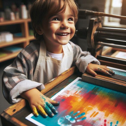
Color Printing Techniques
Color printing techniques in printmaking involve various methods to create vibrant and detailed artwork.
Understanding these techniques is essential for artists looking to achieve accurate and visually appealing prints.
Some common color printing methods include:
Relief Printing
Relief printing is a type of printing where the image is carved onto a block, and the ink is applied to the surface of the block.
The image is then transferred onto paper by pressing it onto the block.
This method is known for its bold and graphic aesthetic, making it ideal for creating high-contrast prints.
Screen Printing
Screen printing involves using a mesh screen to transfer ink onto a surface.
Different stencils are used to block out areas where ink should not be applied, allowing for precise and intricate designs.
This method is versatile and popular for its ability to create vibrant colors and detailed prints.
Lithography
Lithography is a technique where the image is drawn onto a stone or metal plate with a greasy substance.
The plate is then treated with water, which adheres to areas without the greasy substance.
Ink is then applied to the plate, which only sticks to the greasy image.
This method allows for detailed and subtle color variations, making it popular for fine art prints.
Tips for Achieving Accurate Color Registration in Multicolor Prints
Color registration is the process of aligning multiple colors in a print to create a cohesive and detailed image.
Achieving accurate color registration can be challenging but is crucial for producing high-quality prints.
Here are some tips to help you achieve accurate color registration in multicolor prints:
Use Registration Marks
Adding registration marks to your printmaking setup can help you align different colors accurately.
These marks act as guides to ensure proper alignment when printing multiple colors.
By referencing these marks, you can make adjustments to achieve precise registration.
Test Prints
Before printing your final work, it is essential to create test prints to check color registration.
By printing small samples with each color, you can identify any misalignments and make the necessary adjustments before moving on to the final print.
This practice can help you avoid costly mistakes and ensure the accuracy of your colors.
Print in Layers
Printing in layers allows you to build up colors gradually while ensuring precise registration.
By printing each color separately and allowing it to dry before adding the next color, you can control the alignment and avoid color bleeding or misregistration.
This method requires patience but can result in crisp and vibrant multicolor prints.
Color Separations and Their Role in Color Printing Processes
Color separations are a crucial component of the color printing process that involves breaking down an image into separate colors for printing.
Each color separation is created on a different plate or screen and printed individually, allowing for precise color reproduction and control.
Here is an explanation of color separations and their role in color printing processes:
CMYK Color Model
The CMYK color model is commonly used in color printing and refers to the four colors – cyan, magenta, yellow, and black – that are combined to create a full range of colors.
Each color separation corresponds to one of these colors, and when printed together, they can reproduce a wide spectrum of hues and tones.
This method is widely used in commercial printing for its ability to produce accurate and consistent colors.
Role of Color Separations
Color separations allow for precise control over each color in a print, ensuring accurate color reproduction and vibrant results.
By separating an image into its component colors, artists and printers can adjust each color individually to achieve the desired look.
This method is especially useful in multicolor prints, where different inks need to be aligned accurately to create intricate and detailed artwork.
Color Separation Techniques
There are various techniques for creating color separations, including digital methods and traditional hand-drawn techniques.
Showcase Your Business Today
Reach thousands of readers actively exploring professional services. Publish your business profile and grow your audience now.
Publish NowDigital software allows artists to separate colors easily and make adjustments quickly, while hand-drawn separations can offer a more hands-on and artistic approach.
Both methods have their benefits and can be used to achieve accurate color reproduction in printmaking.
Color Theory in Composition and Design
Color theory plays a crucial role in printmaking, as it helps artists create visually appealing and cohesive prints.
Understanding the fundamentals of color theory can greatly enhance the overall impact of a print.
When it comes to printmaking, color theory is essential for determining the palette of a print.
Color theory encompasses concepts like hue, saturation, and value, which are used to create harmonious color combinations.
Using color theory, artists can carefully select colors that evoke specific emotions or convey particular messages.
By understanding how different colors interact with each other, artists can create dynamic, engaging compositions.
Importance of Balance, Contrast, and Unity
Balance, contrast, and unity are key principles in printmaking that are directly influenced by color theory.
Achieving a balance of colors, creating contrast to make certain elements stand out, and maintaining overall unity in a print are essential for a successful composition.
Balance in color theory refers to the distribution of visual weight in a print.
Contrast is achieved by using colors that differ sharply from one another, creating emphasis and visual interest.
Unity ensures that all elements in a print work together harmoniously.
Tips for Using Color Theory
- Start by establishing a color scheme that aligns with the mood or message of your print.
- Experiment with different color combinations to see how they interact and complement each other.
- Consider the psychological effects of different colors and how they can evoke specific emotions in the viewer.
- Use color theory to create focal points and guide the viewer’s eye throughout the composition.
- Remember to balance warm and cool colors to create a harmonious and visually interesting print.
Examples of Successful Prints
There are numerous examples of prints that effectively demonstrate the use of color theory in composition:
- Van Gogh’s “Starry Night” utilizes a complementary color scheme to create a sense of vibrancy and movement.
- Matisse’s “The Dance” features a harmonious blend of colors that convey a sense of joy and celebration.
- Monet’s “Water Lilies” series showcases the subtle variations in color and light that evoke a sense of tranquility and depth.
- Warhol’s famous prints use bold, contrasting colors to create a sense of pop and energy.
- O’Keeffe’s floral prints use subtle shifts in color temperature to convey a sense of intimacy and delicacy.
Basically, color theory is an essential tool for printmakers looking to create visually striking and cohesive prints.
By understanding the principles of color theory and how they can be applied in composition and design, artists can elevate their work and engage viewers on a deeper level.
Conclusion
In this blog post, we explored the fundamental aspects of color theory in printmaking.
We discussed primary, secondary, and tertiary colors and how they interact in a printmaking process.
We also explored complementary and analogous color schemes, demonstrating their ability to create harmony or contrast in prints.
Lastly, we delved into the psychological effects of color, emphasizing its importance in communicating emotions through art.
Applying color theory in printmaking is essential for creating balanced and visually appealing works.
When artists understand the relationships between colors, they can produce cohesive designs that evoke specific emotions.
Mastering these principles ensures successful outcomes, making each print more effective in its visual impact.
I encourage you to experiment with color theory in your printmaking projects.
Don’t be afraid to try new combinations and explore how different hues interact on paper.
Testing new palettes helps improve your understanding of color and its role in art.
By continually practicing color theory, you’ll sharpen your skills and become more confident in your artistic choices.
It’s important to remember that printmaking is a creative journey where color plays a vital role.
Take the knowledge gained here and apply it to your next print, allowing yourself to grow as an artist.
Color theory is a powerful tool that can elevate your printmaking to the next level.
Use these principles, stay curious, and enjoy the process of discovery.
Through practice and exploration, you’ll continue to improve your printmaking skills and create captivating works of art.
[E-Books for Sale]
The Big Book of 500 High-Paying Jobs in America: Unlock Your Earning Potential
$19.99 • 500 High-Paying Jobs • 330 pages
Explore 500 high-paying jobs in America and learn how to boost your career, earn more, and achieve success!
See All 500 High-Paying Jobs of this E-Book
1001 Professions Without a Degree: High-Paying American Jobs You Can Start Now
$19.99 • 1001 Professions Without a Degree • 174 pages
Discover 1001 high-paying jobs without a degree! Unlock career tips, skills, and success strategies for just $19.99!